02 Oct, 2010, KaVir wrote in the 102nd comment:
Alayla suggested using CC0000 for the red, and I thought she meant applying the same to all three - I quite like the slightly darker results. However she clarified that she only meant the red, keeping the darker blue/green from my earlier screenshot here.
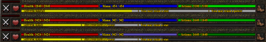
Here are all three - the first is the old approach, the second is with CC0000 for all three, and the third is with CC0000 red, slateblue (R=106, G=90, B=205) and green (R=0, G=128, B=0):
It could also be made configurable I guess, perhaps via an in-game command.
Here are all three - the first is the old approach, the second is with CC0000 for all three, and the third is with CC0000 red, slateblue (R=106, G=90, B=205) and green (R=0, G=128, B=0):
It could also be made configurable I guess, perhaps via an in-game command.
02 Oct, 2010, Rudha wrote in the 103rd comment:
I like the bottom, personally. A config option wouldn't be a horrible idea since such things are subjective preferences, as long as how to change it is well documented (I've played a few muds that to my frustration implemented nice player configuration systems … that were completely undocumented.)
Maya/Rudha
Maya/Rudha
02 Oct, 2010, KaVir wrote in the 104th comment:
Also toying with a red that fits better with the slateblue - firebrick is quite nice, but perhaps a bit dark? I've also used forestgreen instead of green, as it's a fraction less harsh.

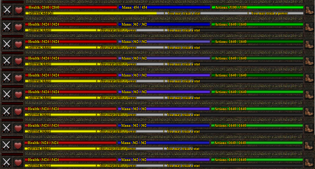
Click here for the full screenshot, including partially empty bars for contrast.
Click here for the full screenshot, including partially empty bars for contrast.
02 Oct, 2010, Rudha wrote in the 105th comment:
Yeah, that's a bit easier on the eyes, I like it.
Maya/Rudha
Maya/Rudha
02 Oct, 2010, KaVir wrote in the 106th comment:
Here are the old bars again, along with some new ones:
Currently favouring one of the last two.
Currently favouring one of the last two.
03 Oct, 2010, KaVir wrote in the 107th comment:
02-Oct-2010: I'm now using the new energy bar colours, and they're pretty nice. While playing with them I noticed that the bars were off by 1 pixel - that is, they had 2 "bright" pixels in the middle despite being an odd number of pixels high, so they got a bit darker at the top than than at the bottom. I tried changing them to have 1 bright pixel in the centre, but they didn't look as good, so in the end I changed them to 3 bright pixels (which required manually drawing an extra line in the middle). A lot of work for something most people probably wouldn't notice, but once I'd seen it I felt compelled to fix it. Did the same for the enemy avatar's energy bar, even though it's thinner - once again it looked a bit iffy with just 1 bright pixel in the centre.
Based on a suggestion from Alayla, I've also added a (1 pixel wide) black line at the left and right end of each bar.
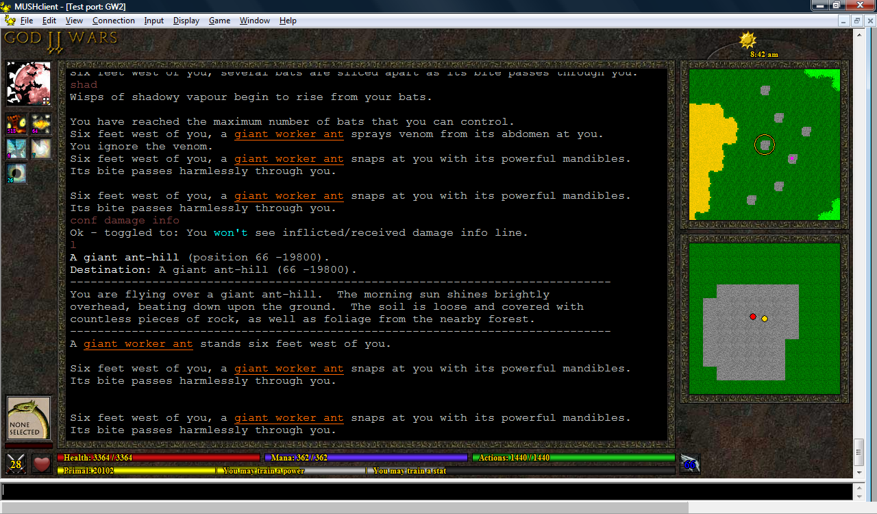
Alayla has provided some new movement icons - a pouncing boot, a retreating boot, a wing (for hovering, flying and swooping) and a fin (for swimming). In combination with the coloured text, this provides full coverage for all the different movement speeds.
I've left the pie-shaped timers for now, as I think they're a fairly good way to see at a glance which spells are soon to expire - but I still plan to do more work on them. Their brightness now only changes when the duration drops below 60 seconds.
Based on a suggestion from Alayla, I've also added a (1 pixel wide) black line at the left and right end of each bar.
Alayla has provided some new movement icons - a pouncing boot, a retreating boot, a wing (for hovering, flying and swooping) and a fin (for swimming). In combination with the coloured text, this provides full coverage for all the different movement speeds.
I've left the pie-shaped timers for now, as I think they're a fairly good way to see at a glance which spells are soon to expire - but I still plan to do more work on them. Their brightness now only changes when the duration drops below 60 seconds.
07 Oct, 2010, Tavish wrote in the 108th comment:
Just wanted to say this plugin is pretty dang nifty. Using it as a basic template I was able to get a MSDP enabled client up and running for my game in a few hours. Of course the game isn't far into development so the client uses only the health bars and map screen miniwindows but even a more fully developed game could benefit just as quickly.
I would post some screenshots but it would be pretty embarrassing ATM since I haven't changed any layout other than the background/window borders. Once I get a few new things implemented I will get something posted.
I would post some screenshots but it would be pretty embarrassing ATM since I haven't changed any layout other than the background/window borders. Once I get a few new things implemented I will get something posted.
07 Oct, 2010, Tavish wrote in the 109th comment:

Like I was saying, haven't messed around with layout too much but have been testing hotspots out. The map window is divided into 8 hotspots that change the direction the player is moving (indicated by the bad art arrow in the center of the map). The walk speeds below the map window are also hotspots to change the movement speed.
07 Oct, 2010, KaVir wrote in the 110th comment:
Nice! By the way if you post more screenshots, you might want to try png format rather than jpg, it should look clearer.
My plugin is still using an older format for some of the data (such as spell affects) and hasn't yet been updated to reflect the latest MSDP spec - I've noticed a lot of players don't bother updating to newer versions unless pressured, so I plan to do a big update in one go so that I don't keep breaking things in older versions.
Anyway, people are welcome to copy whatever they like from my plugin xml files, but the graphics aren't mine so I can't give permission for those (plus they're thematically tied to my mud, so it would look a bit odd if other muds used them). Still, it's fairly easy to add your own background texture like Tavish has done, and you could do the same for borders if you want those.
The MSDP plugin is getting pretty big though, I think at some point I'll release a simpler and more generic version.
07 Oct, 2010, Tavish wrote in the 111th comment:
KaVir said:
Anyway, people are welcome to copy whatever they like from my plugin xml files, but the graphics aren't mine so I can't give permission for those (plus they're thematically tied to my mud, so it would look a bit odd if other muds used them). Still, it's fairly easy to add your own background texture like Tavish has done, and you could do the same for borders if you want those.
I know it might be a futile effort, but you might consider putting a notice of some kind or another in the plugin download that states something to that affect (similar to what you have for allavatars.com). The chances are zero that everyone would read the notices and follow it even if they did, but might make a few people aware who wouldn't be otherwise.
Quote
The MSDP plugin is getting pretty big though, I think at some point I'll release a simpler and more generic version.
Yeah it is definitely getting up there in size (1600+ lines). My version pales in at about 350.
09 Oct, 2010, Rudha wrote in the 112th comment:
KaVir: An interesting thing for those of us that have never really done that kind of thing with MushClient before would be some sort of basic explanation or something as to how you got that going. I always liked that MushClient had that kind of potential (and was free, as I'm not paying for a mud client in this day and age…) but I know that I, personally, if not anyone else, found the documentation a little … unhelpful as regards developing that sort of GUI.
Not to say you have to do that or anything. Just throwing that out there I guess. It'd be useful. Especially since its coming from the perspective of someone who hasn't really messed with GUIs before.
Maya/Rudha
Not to say you have to do that or anything. Just throwing that out there I guess. It'd be useful. Especially since its coming from the perspective of someone who hasn't really messed with GUIs before.
Maya/Rudha
09 Oct, 2010, David Haley wrote in the 113th comment:
Rudha said:
I, personally, if not anyone else, found the documentation a little … unhelpful as regards developing that sort of GUI.
A lot of examples were given in the forums rather than formal documentation. In fact, he gives complete source code examples for most if not all of his Aardwolf integration plugins.
09 Oct, 2010, Rudha wrote in the 114th comment:
Yeah but I not really talking about having the source - though thats also nice - so much as a tutorial or walkthrough kind of thing.
As in, being taught to fish, instead of just being given a fish.
Not a big deal and it may exist already, but if it does its not in the MC docs.
As in, being taught to fish, instead of just being given a fish.
Not a big deal and it may exist already, but if it does its not in the MC docs.
10 Oct, 2010, donky wrote in the 115th comment:
David Haley said:
What would you suggest instead, donky? Candy colored or gradients but not both?
It may just be my personal opinion, but I think both of these things are detrimental. The candy colouring is disjoint because it does not match the rest of the colouring. And the gradients, are an old fashioned and clunky styling that should have died with other things from its time like Marillion and Depeche Mode. I like the bars that Kavir gave without the gradients, and with paler colours and a bit of work to get the font and bar working together stylistically.. then it would have Donky's official thumbs up (for what that's worth).
14 Oct, 2010, KaVir wrote in the 116th comment:
13-Oct-2010: I decided to have a play with buttons. I'd originally thought about putting them at the top, but long ago dismissed it as a wierd place to have buttons - however last night I got thinking about tying them to the function keys, and also making them available as hotkeys. Not only does this fill the space at the top of the interface, it's also quite a logical place if they're bound to function keys.
This is my initial draft, just to get the ball rolling:
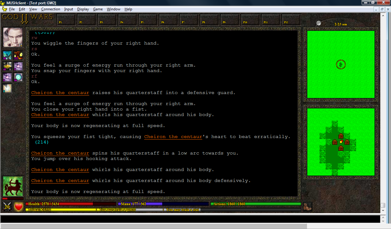
The idea is that players will be able to define what F1 to F12 do within the mud, and this information will be passed to the plugin, which will then configure the function keys. So you might define F1 as 'rage' and F2 as 'magic', and the mud would then send these values to the plugin, which would display 'Rage' and 'Magic' on the respective buttons (or perhaps add a little icon, I've not yet decided). You could then either click the button with your mouse, or press the function key on your keyboard.
It might also be cool if you could right-click the button to bring up a little window for configuring what the button does. This data would then be sent to the mud, which would confirm that it was valid, and then tell the plugin what to set - this might seem a bit of a roundabout approach, but I think it would be the easiest to implement. However I'm not sure if you'd be able to have an input field in the miniwindow…but what might work is to have it bring up a large menu of possible commands, rather like Guild Wars, and let the user click (or even drag-and-drop) which options they want on their buttons.
The hotkeys can be set with the Accelerator function (which, I discovered, can also be bound to a range of other keys - this could perhaps allow you to emulate character mode enough to create a graphical Roguelike interface). I also discovered that Accelerator allows you to send negotiation sequences, although sadly these still get echoed to your screen (as junk characters), and I don't know how to avoid this without switching off input echo completely from within the MUSHclient settings.
Another minor issue is that hitting F1 attempts to bring up the Windows help, even if you've bound F1 to something else. You can get around this by toggling an option in the preferences, but I don't know if it can be done from within the plugin.
From a cosmetic perspective, it seems a bit strange to have the "F1"/etc text label displayed in the bottom left corner of the button. I feel that it should be in the top left. But that looks a bit strange when compared to the spell icons. On the other hand, if I decide to include an icon on each button as well, perhaps the text could be made bigger and placed in the centre left.
There's also the issue of button width. Like the energy bars, the buttons are aligned with the text window - which means their width can vary. This was easy enough to do for the energy bars, but it's going to be more fiddly for the buttons, particularly if they contain text and images.
I've also not yet given up hope on having some tabs (for things like a full-world map, an equipment and inventory list, etc), but if I still want these at the top I'll have to make the buttons smaller. They could instead be placed at the right side of the window though.
This is my initial draft, just to get the ball rolling:
The idea is that players will be able to define what F1 to F12 do within the mud, and this information will be passed to the plugin, which will then configure the function keys. So you might define F1 as 'rage' and F2 as 'magic', and the mud would then send these values to the plugin, which would display 'Rage' and 'Magic' on the respective buttons (or perhaps add a little icon, I've not yet decided). You could then either click the button with your mouse, or press the function key on your keyboard.
It might also be cool if you could right-click the button to bring up a little window for configuring what the button does. This data would then be sent to the mud, which would confirm that it was valid, and then tell the plugin what to set - this might seem a bit of a roundabout approach, but I think it would be the easiest to implement. However I'm not sure if you'd be able to have an input field in the miniwindow…but what might work is to have it bring up a large menu of possible commands, rather like Guild Wars, and let the user click (or even drag-and-drop) which options they want on their buttons.
The hotkeys can be set with the Accelerator function (which, I discovered, can also be bound to a range of other keys - this could perhaps allow you to emulate character mode enough to create a graphical Roguelike interface). I also discovered that Accelerator allows you to send negotiation sequences, although sadly these still get echoed to your screen (as junk characters), and I don't know how to avoid this without switching off input echo completely from within the MUSHclient settings.
Another minor issue is that hitting F1 attempts to bring up the Windows help, even if you've bound F1 to something else. You can get around this by toggling an option in the preferences, but I don't know if it can be done from within the plugin.
From a cosmetic perspective, it seems a bit strange to have the "F1"/etc text label displayed in the bottom left corner of the button. I feel that it should be in the top left. But that looks a bit strange when compared to the spell icons. On the other hand, if I decide to include an icon on each button as well, perhaps the text could be made bigger and placed in the centre left.
There's also the issue of button width. Like the energy bars, the buttons are aligned with the text window - which means their width can vary. This was easy enough to do for the energy bars, but it's going to be more fiddly for the buttons, particularly if they contain text and images.
I've also not yet given up hope on having some tabs (for things like a full-world map, an equipment and inventory list, etc), but if I still want these at the top I'll have to make the buttons smaller. They could instead be placed at the right side of the window though.
14 Oct, 2010, Mudder wrote in the 117th comment:
I really like this. It's come a long, long way since you started. I'm excited about the generic mud GUI.
You've convinced me to do something similar when the time comes. Thanks KaVir!
You've convinced me to do something similar when the time comes. Thanks KaVir!
14 Oct, 2010, Bobo the bee wrote in the 118th comment:
KaVir said:
The hotkeys can be set with the Accelerator function (which, I discovered, can also be bound to a range of other keys - this could perhaps allow you to emulate character mode enough to create a graphical Roguelike interface). I also discovered that Accelerator allows you to send negotiation sequences, although sadly these still get echoed to your screen (as junk characters), and I don't know how to avoid this without switching off input echo completely from within the MUSHclient settings.
Could you, perhaps, set the Accelerator to send an alias that disables ECHO, sends the command, then re-enables the echo, should it be on at the time of sending? Like 'disableecho rage'?
14 Oct, 2010, Scandum wrote in the 119th comment:
Wouldn't it be better to create a documented general purpose server side data storage mechanism for MSDP?
14 Oct, 2010, Tavish wrote in the 120th comment:

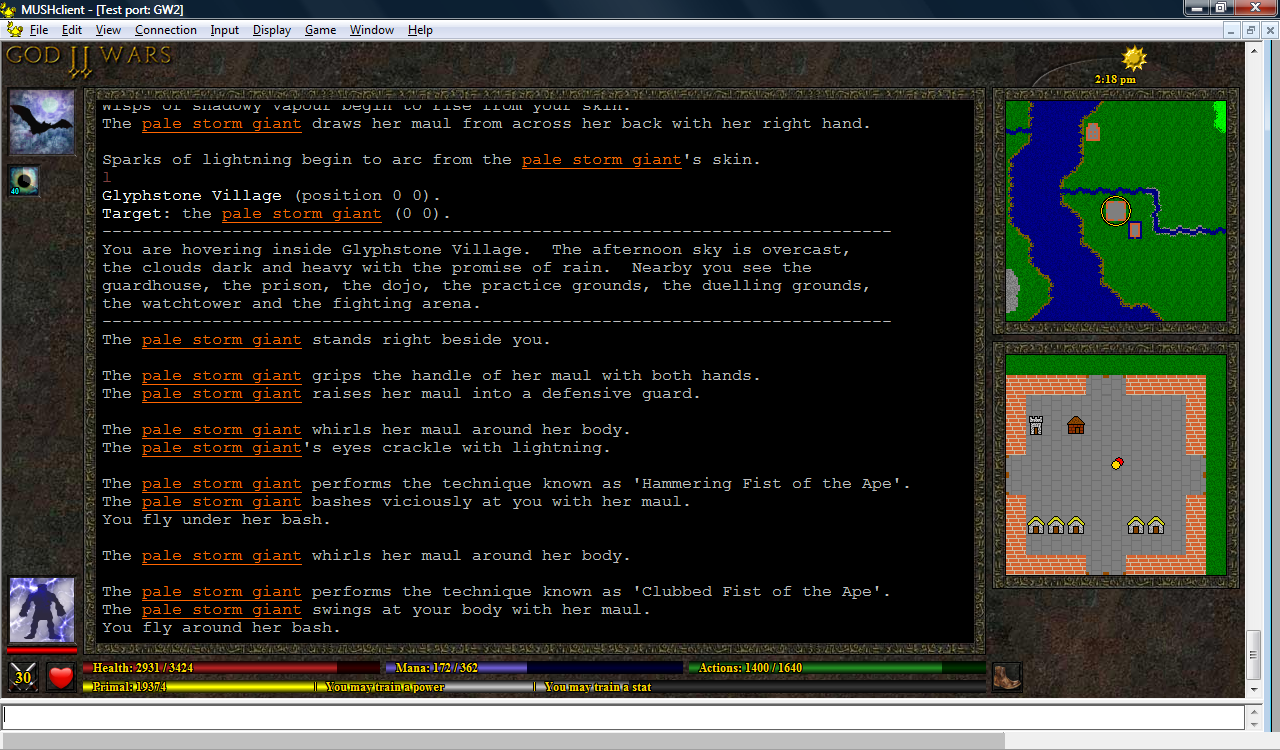
Basic support for Mob listing and targeting in place. The panels in the target listing window are hotspots that execute the target command to change who you are attacking. The MSDP is also passing the HP min/max of the creature (also a reference to what will be a image file for the creature type), I just haven't decided a good way to display it. Dynamic windows inside windows inside windows gets a bit hairy. Haven't decided how I want to handle the map window display of the creatures yet either. I will probably wuss out and go with the rogue style ascii representation instead of an image. At least until I find small enough sprites that are still somewhat recognizable at that size.
Random Picks
Maya/Rudha