22 Aug, 2013, Arynth wrote in the 42nd comment:
Graphics can be used to enhance things (or at least make them pretty). Most of your arguments could have been made for color in general back before using colors in muds became standard. And, I did also say that clients can change colors of text as well, though I may have said it poorly.
I do a lot of moving of data around with Mushclient, though most of it just ends up being moving text around on the screen, out of the main flow of data coming from the mud. Inventory window, Exits in a little text-style compass, etc. I did make graphical bars for Health and such, but with the overlay of the values so I can see exact numbers as I need. I could also add the color changing as well, and have thought of doing so before. I do find myself glancing at the bar, just to see a relative position of where it is at times, instead of having to math in my head and go "Ok, is 24000 less than half of my max of 50000…", but, again, different colors could help that as well.
Graphics just provide a different way of showing things off. Cars use it on Dashboards to keep from having drivers have to read numbers (or because the numbers would distract them from driving in general). I'd rather not have my instrument panel changing colors on me as I increased my speed while driving, just moving a needle is enough for me.
22 Aug, 2013, Rarva.Riendf wrote in the 43rd comment:
Quote
Cars use it on Dashboards to keep from having drivers have to read numbers
Because when you drive you dont really need to know if you are exactly 47 48 or 49 km/h you just need to know you are under 50. (as an example, your speed limitations laws may vary)
But that is why you have speed limiter as well. You dont need exact values, because indeed that would be useless and distracting, thus dangerous.
Quote
a color is faster to interpret than if a length of a bar is just below or just above a thresold. and a % even faster.Ok, is 24000 less than half of my max of 50000
Actually a bar is a very poor way for a % guess , a pie chart is better for that. But it takes more space. I do not deny graphics are useful for some kind of infos. But when you already have the text anyway cause you play a text game, the graphics itself is becoming distractful as it makes you leave the text area to look at the graphic area.
22 Aug, 2013, plamzi wrote in the 44th comment:
Rarva.Riendf said:
Because when you drive you dont really need to know if you are exactly 47 48 or 49 km/h you just need to know you are under 50. (as an example, your speed limitations laws may vary)
But that is why you have speed limiter as well. You dont need exact values, because indeed that would be useless and distracting, thus dangerous.
But that is why you have speed limiter as well. You dont need exact values, because indeed that would be useless and distracting, thus dangerous.
Rarva, exactly, but I'm afraid you're starting to argue against some of your earlier points here :)
Rarva.Riendf said:
a color is faster to interpret than if a length of a bar is just below or just above a thresold. and a % even faster.
This is kind of funny, but the word "threshold", you know it's an image, right? So, a threshold can be drawn on a bar to indicate 1/2 length, and the color of a bar can change just like you described earlier. Color is not text. Colored text is already delivering a visual statement as well as a textual one.
A percent is faster at delivering exact information, but it puts the brain at work. A string of percents will be impossible to interpret at one glance, whereas a set of bars can be. That is why, when people are piloting planes or playing games, many items of information are condensed to visual representations. That is why we have data graphs and charts.
22 Aug, 2013, Rarva.Riendf wrote in the 45th comment:
Quote
Rarva, exactly, but I'm afraid you're starting to argue against some of your earlier points here :)
Not really I said gauge coud be part of a gameplay where exact values were not actually needed.
Quote
A percent is faster at delivering exact information, but it puts the brain at work.
Nope. you just read it and instantly you will have the info.
Quote
A string of percents will be impossible to interpret at one glance, whereas a set of bars can be.
I disagree, you can look at more % values at the same time that you can look at the same number of bars. (unless they are tiny one, thus very unprecise) and, again you make like if those bar where in front of your eyes, that is wrong when you play a text game. You have to look away from what you were reading too look at those bars thus need to focus on them, then go back to the text. It is very distracting to then refocus to the text you were reading especially if it changed of place because of some other event.
Quote
That is why we have data graphs and charts.
Not really. we have them to display numerous AND related value in the place. Health is not related to mana. It is its own value and cannot be compared to it, so both need their own display.
Graphics are cool in a graphical game, mixing both is a fundamental UI problem in my opinion. That is jsut what it is though, an opinion. But everytime I look at a mud that wants to do both, I cringe. When I look at Kavir's interface , I find it pretty, but distracting. I don't know where to look at. Too many different kind of display.
Oh and text is not limited to color for info, you can add bold and italic and even blinking as well. thats a lot of info for 'free'
22 Aug, 2013, plamzi wrote in the 46th comment:
Rarva.Riendf said:
Nope. you just read it and instantly you will have the info.
Quote
A percent is faster at delivering exact information, but it puts the brain at work.
Nope. you just read it and instantly you will have the info.
I understand where you're coming from, but where you're coming from is a very biased place, and you shouldn't use your bias to argue universals. Even to people like us, a percent is only faster at delivering the abstract concept of percent. It is much slower at delivering the concept of "Ouch!", which is why every FPS just flashes your screen red.
Text has many qualities, but speed of delivery is not one of them. Reading a description of a bear is not faster than seeing a photo of said bear. It may be more meticulous and artful, and it may result in a sharper mental *image* of the bear when you're asked to describe it the next day, but it's not faster.
The bottom line is, image works better on most people for most things. It also transcends language barriers. There are cultures on this planet that don't even know the meaning of the % symbol. Whether you personally prefer colored, italicized, and blinking text and whether you believe you can read a % faster than a gauge is immaterial. Most folks find an image much more immediate than a symbol.
22 Aug, 2013, Rarva.Riendf wrote in the 47th comment:
Quote
It is much slower at delivering the concept of "Ouch!", which is why every FPS just flashes your screen red.
Again you speak about a graphical game to begin with…(and a sound is even more efficient for that actually _ in this case_)
Quote
Text has many qualities, but speed of delivery is not one of them.
All depends on what you need to deliver.
http://www.bing.com/images/search?q=ecra...
Try using everything else than text for this kind of info. (and I find using the logo of the compagny a bad move, hard to find yours if you dont know the logo, but I guess they used it to save space on the screen, not because it was easier.)
22 Aug, 2013, KaVir wrote in the 48th comment:
Hades_Kane said:
I wouldn't be -against- adding graphical elements to my game, particularly in the vein of status bars, maps, etc., but those things would need to be optional of course (all of this being possible with KaVir's snippet, which I do have installed for the MSSP, unicode support, and expanded colors). However, I feel like my time would be better devoted to improving OLC, adding in new features, coding skills, making new areas, or creating new quests, as those are the meat and potatoes of the game, graphical elements are just peripheral bells and whistles, and no matter how much you dress up a game with those, if it doesn't have a solid core, it's still a crappy MUD. I know there are plenty of people out there that would prefer a crappy, semi-graphical game to an extremely well crafted text based game, but that's not really my "target" anyway.
It's not an "either or", you need to pay attention to both the game and the aesthetic.
A fancy interface obviously won't turn a bad game into a good game. But equally, if your mud is poorly presented and the interface is very clunky, it won't matter how many fancy features you've got, because nobody will hang around long enough to try them.
Even if you're sticking to pure text, you still need to put time and effort into the presentation and interface. Check your formatting, layout, spelling, and grammar. Provide a command set that's consistent and intuitive to use. Make sure the help files are accurate and concise.
And then there are the technical options. ANSI colour, XTerm colour, MXP colour. Clickable links. Unicode. Control codes. Custom fonts. And of course graphics and sound. Each of these options are tools that can be used to further improve the presentation and interface. None of them are required, each of them can be used well or used poorly. But they are just tools, and whether you use them or not, you will still need to put effort into the aesthetic of your mud.
22 Aug, 2013, quixadhal wrote in the 49th comment:
I see lots of people suggestion various ways to add graphics to a primarily text game. I think that's fine, and if the graphics helps people try and like your game, go for it! However, you are still running a text game, and you have to remember the graphics, sound, and fancy UI are just enhancements.
They don't need to be OPTIONAL enhancements. You could, for example, write a custom client and make redesign your game to use a graphical terrain map. You could then do away with the text-based navigation and room description system and just have text be the primary interaction for players, quests, etc. Some would argue you've already become not-a-MUD. But you also aren't quite a fully graphical game either.
My earlier post was addressing the idea of making your game become a fully graphical game. THAT I see as a losing battle, because there are already plenty of them that are far above what you're likely to be able to do. If you had the talent and resources to make a game that can compete on that level, it would be your career, not your hobby.
22 Aug, 2013, Hades_Kane wrote in the 50th comment:
"If I'm creating a game then one of my primary goals is to get as many players to enjoy it as possible regardless of whether they are 'interesting' players or not."
Trying to cater to everyone will create a game that satisfies nobody.
The best games, in my opinion, are the ones where the creator or creative team have a vision and stick to it with a little less of a concern on whether they are maximizing the amount of players they will get.
Unless, of course, you are trying to earn money with your game, then your goal is as baseline, mediocre game that you can muster, because anything genuinely challenging, different, or creative will be less successful.
On the topic of prompts, gauges, etc… We have always had ASCII gauges as an option instead of raw numbers… almost no one uses the gauges though, they prefer the numbers. It's like on my iPhone, I have the actual numerical % of my battery showing rather than the little gauge. For critical information, like your hp or your phone's battery, I've always found numbers to be much better. We do have gauges for non critical information, like our limit break meter and such, though.
"Even if you're sticking to pure text, you still need to put time and effort into the presentation and interface. Check your formatting, layout, spelling, and grammar. Provide a command set that's consistent and intuitive to use. Make sure the help files are accurate and concise. "
Yeah, pretty much from day one, those have been big concerns for us. There is always more work to be done, but there is a relatively color neutral, consistent layout throughout the game, we are pretty good on the spelling and grammar, and with as much as we deviate from stock ROM, we really do try to make the commands that people would generally be familiar with from there compatible with the other enhancements we've made as well.
22 Aug, 2013, plamzi wrote in the 51st comment:
Hades_Kane said:
The best games, in my opinion, are the ones where the creator or creative team have a vision and stick to it with a little less of a concern on whether they are maximizing the amount of players they will get.
That's true, a good game is usually not a whore (except for maybe WoW). But the whole thing is a balancing act, between vision and marketability, let's say. All other things being equal, a good online game that improves its reach will do better than a good game that wears its shrinking playerbase as a badge of honor. In the long run, one of the two is doomed, because even the greatest online game with 0 players has 0 impact on history.
In this community, I don't think we have a problem with games falling over themselves to try to please everyone. We have a much bigger problem with mediocre or underdeveloped games that proudly assume they're not getting any new players because they refuse to "sell out", but all they do is water down the field and make good games harder to find.
To me, adding graphics is an integral part of trying to make the game more engaging and easier to play. I can think of a hundred mechanics in my game that will be easier to use if they were visualized in different ways. I'm too busy, and too excited, to draw any artificial lines beyond which I have "sold out".
22 Aug, 2013, Rarva.Riendf wrote in the 52nd comment:
Quote
We have a much bigger problem with mediocre or underdeveloped games that proudly assume they're not getting any new players because they refuse to "sell out", but all they do is water down the field and make good games harder to find.
And that was true from the very beginning :)
Random Picks
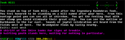
Well that is configuration (nobody ever asked for changing the treshold yet though). Do not forget clients can also do that easily by reading the prompt and overiding the color by triggers. I did that myself when it did not exists, but I try to make fully pledge clients the least useful possible:) old school first.
My config options yet
Command Action Status
——————————————————————–
[autoassist] automatically help group members …………..OFF
[autoexit] show exits ON
[autodoor] automatically open doors ………………….OFF
[autogold] get all the gold from corpse ON
[autoloot] get all objects from corpse ……………… OFF
[autotrack] automatically track opponents OFF
[autopeek] automatically peek when looking ………….. ON
[autosac] sacrifice corpses <hp-mana-moves-gold> OFF
[autosplit] automatically share gold with group ………. OFF
[rp] RP status (OOC = OFF) OFF
[nofightspam] hide dodge/parry/etc messages ……………. ON
[zerofightspam] the least possible fight spam ON
[mccp] activate Mud Client Compression Protocol ….. OFF
[mxp] activate MUD eXtension Protocol ON
[prompt] show prompt ……………………………. ON
[compact] suppress blank line before prompt OFF
show items size ………………………… OFF
[brief] hide room description OFF
[combine] regroup same items of same kind ………….. ON
[nogive] do not accept gift from people OFF
[nobeep] refuse to be beeped …………………….. OFF
[noloot] accept to be looted/stolen by people ON
[nofol] do not care about being followed …………. OFF
[nogroup] refuse to be grouped OFF
[minimap] minimap size(5) vnum(shown ) pos(left ) …… ON
[nosummon] do not care about being summoned OFF
[setpk] can choose to pk till level 95 …………… ON
[merciful] stop fighting with stunned player OFF
[nolevel] block exp gain …………………………. OFF
(everything is clikable so you can turn on an off option with the mouse if you want)
Your current color setup is:
normal color : grey prompt color : norm
room color : magenta desc color : green
exits color : magenta people color : green
objects color : yellow fights color : yellow
damage color : red tells color : magenta
ooc color : cyan say color : yellow
imm color : white hero color : white
info color : red shout color : null
imp color : null senior color : null
ic color : null snoop color : null
group color : null were color : null
vamp color : null slay color : null
psi color : null
To change colors, type 'color <type> <color>'
<TYPES> normal prompt room desc exits people objects fights tells ooc say
imm hero info shout imp senior ic snoop group were vamp slay
psi
<COLORS> 0:null 1:red 2:green 3:yellow 4:blue 5:magenta 6:cyan 7:white 9:norm 10:grey 11:b_red 12:b_green 13:b_yellow 14:b_blue
16:b_cyan 17:b_white 18:bg_black 19:bg_red 20:bg_green 21:bg_yellow 22:bg_blue 23:bg_magenta 24:bg_cyan 25:bg_white
Or: 'color on|off|default'
text UI is enhanced by tactful colors, not graphics :)