08 Jul, 2010, Runter wrote in the 42nd comment:
Well, yes. That's kinda what I was thinking. You might not need to re-implement all those things you mentioned if you maintained a plain text log as well. (Where presumably it would display anything you'd want to copy and paste and more.)
08 Jul, 2010, Brinson wrote in the 43rd comment:
The mudlet website has some screenshots of it modified for muds that look really nice. Would be great to see more muds doing this kind of thing.
08 Jul, 2010, KaVir wrote in the 44th comment:
Brinson said:
The mudlet website has some screenshots of it modified for muds that look really nice. Would be great to see more muds doing this kind of thing.
Most of those I've seen tend to be "private" setups created by individual players for their own use. I think it'd be nice to see more muds offering such plugins/scripts to their players, particularly for newer players.
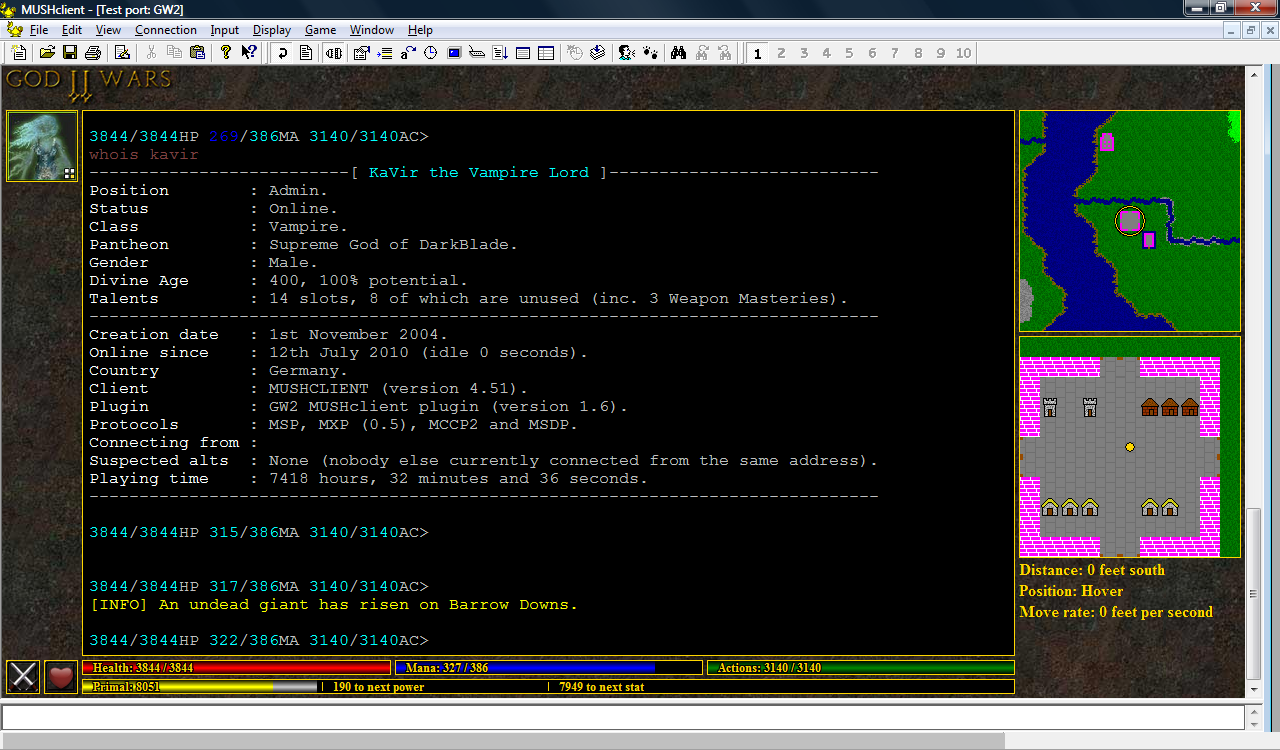
12 Jul, 2010, KaVir wrote in the 45th comment:
12-Jul-2010: I've been busy with other things recently, but one of my players has been working on his own plugin, and he sent me his building icons for the zoomed (bottom) map - so I thought I'd see what they looked like. His maps are smaller than mine (10x10 pixel tiles instead of 20x20), so I had to enlarge them and tweak them a bit, but I think they look pretty good (compare with the screenshot in post #9)- it makes me wonder if it would be viable to have better creature icons as well? I'm undecided…but I think the map would really need to be bigger for that to work.
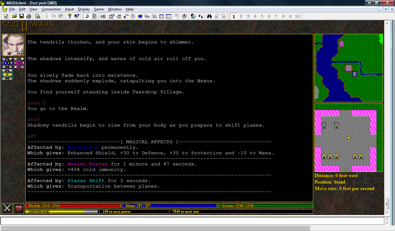
15 Jul, 2010, KaVir wrote in the 46th comment:
14-Jul-2010: Finally got the spell icons working. The infinity symbol was a bit tricky - I had to overlap two letter Os, taking into account their black outlines. The server is currently still sending the same icon for every spell, but the plugin will display whichever icon is specified.
15 Jul, 2010, Igabod wrote in the 47th comment:
so what do the numbers in the spell icons refer to? cost to cast or number of times you can count? I like what you've done with the mini maps, looking good. Keep up the good work. I'm interested in seeing how this turns out.
15 Jul, 2010, KaVir wrote in the 48th comment:
The numbers are the duration in seconds (thus the infinity symbol for the permanent spell), while the colour of the border and text indicates the spell type - red for debuffs, magenta for buffs, blue for permanent buffs and cyan for non-dispellable affects (typically things that aren't actually spells, but use the same mechanics, such as shapechanging or shifting planes). This is the same good/okay/bad/awful colour scale used throughout the mud, so the colours were selected for consistency rather than artistic purposes. Hovering over the icon will also tell you the spell name.
I'm wondering if it might look better in a "minutes:seconds" format. I don't want to make it too long though, otherwise the font will need to be made smaller, and that'll make it more difficult to read.
Progress is definitely slowing down, and not just because I'm sidetracked with other things. Getting the basics in place was fairly quick, but now I'm struggling to decide what information is important enough to be included, and how best to present it. Too many buttons and icons detract from the interface, and it's difficult to know where to draw the line between "useful" and "excessive" - the mud is still primarily a text-based game, after all.
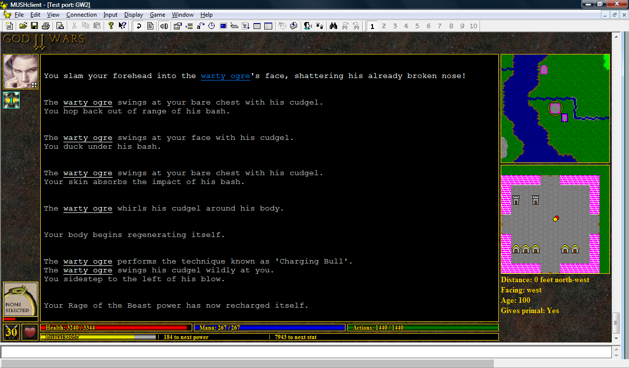
17 Jul, 2010, KaVir wrote in the 49th comment:
17-Jul-2010: I'm playing around with enemy information right now. I noticed it's much easier to keep an eye on your opponent's health if the information is displayed in the bottom left. The downside is that that separates it from other target information such as distance and direction (currently in the bottom right), and that's not so easily packed into such a small space.
I had considered using the right side to display a list of avatars for all creatures within your line of sight, each with its own little health bar, in which case your target's avatar could simply be enlarged. But your current target is far more important, so I don't think it's a problem separating it from the others.
Another option would be to put it under the player's avatar (top left), but that would interfere with the spell icons, unless there was always an avatar (i.e., a blank one if you're not fighting anyone).
One player also suggested putting the avatar above the text window, but I think that would look a bit odd, and there's not much space (unless the avatar were made smaller). The original plan was to use that space for tabs, but I think that'll be a long-term project…however I may put some general purpose buttons there instead.
17 Jul, 2010, Chris Bailey wrote in the 50th comment:
Kavir - How about using a type of progress bar on each spell icon to indicate the time remaining? You could use the image itself as the progress bar if you just converted it to greyscale as time elapsed. Initially it might be a bit more difficult to tell exactly how much time is remaining but you would quickly learn. It seems like that would allow you to be more specific when dealing with short spell durations?
17 Jul, 2010, ralgith wrote in the 51st comment:
Chris Bailey said:
Kavir - How about using a type of progress bar on each spell icon to indicate the time remaining? You could use the image itself as the progress bar if you just converted it to greyscale as time elapsed. Initially it might be a bit more difficult to tell exactly how much time is remaining but you would quickly learn. It seems like that would allow you to be more specific when dealing with short spell durations?
And how would that handle spells that have an accumulative affect? I mean, I've had accum spells at 32,000 ticks time left before..
Would you only count down the last 30 ticks?
17 Jul, 2010, Chris Bailey wrote in the 52nd comment:
If the duration of the spell increased then you would reset the progress bar?
17 Jul, 2010, Tonitrus wrote in the 53rd comment:
ralgith said:
And how would that handle spells that have an accumulative affect? I mean, I've had accum spells at 32,000 ticks time left before..
Could easily change the color of the bar and add a multipler number (or multiplier bar, but that gets more confusing). e.g., 32,000 ticks on something that starts off as 32 could look like a permanent spell with "x1000" on it.
17 Jul, 2010, ralgith wrote in the 54th comment:
Chris Bailey said:
If the duration of the spell increased then you would reset the progress bar?
You missed the point, that would mean that the same amount of space on a bar would indicate a different amount of time. Which means you wouldn't be able to figure out how much "time" you have left. No thanks.
17 Jul, 2010, KaVir wrote in the 55th comment:
It might be interesting to use something like Nick Gammon's cooldown buttons, which dim the icon in a pie shape to indicate progress, for the last 30 seconds or so. However I think most players would want to see the exact duration as well.
18 Jul, 2010, Chris Bailey wrote in the 56th comment:
Ralgith, I wasn't understanding what you meant. You simply alter the speed at which the progress bar progresses. While you might not immediately know exactly how long remains, it wouldn't take long to get an idea. Something as simple as flashing the icon could alert you when the duration changes. I don't see any particular need to know *exactly* how long every spell will last. The system has been implemented in several games that I have played and progress bars are used universally, they can't be that bad.
18 Jul, 2010, Chris Bailey wrote in the 57th comment:
KaVir said:
It might be interesting to use something like Nick Gammon's cooldown buttons, which dim the icon in a pie shape to indicate progress, for the last 30 seconds or so. However I think most players would want to see the exact duration as well.
There is a flash based RPG that seems to be (imho) very successful. I can't think of the name right now but it has fast paced combat and timing is of the utmost importance. It would seem that you need to know exactly how much time remains between using abilities and when effects wear off, but the system I'm attempting to describe seems to work perfectly. It takes a very small amount of adjustment but I find it preferable in the end. It's easier, at least for me, to process 15 progress bars as opposed to 15 hour:minute:second durations. That would be a lot of information to take in with a glance, no?
18 Jul, 2010, ralgith wrote in the 58th comment:
Mmmm, all I know is that I prefer to know exactly how much time is remaining on each spell. But that's my personal preference.
18 Jul, 2010, ATT_Turan wrote in the 59th comment:
I haven't tooled around much with MUSHClient's graphical customization, but can you create mouseover information windows? That would let you use a shaded cooldown icon like Chris is describing, but you could hover your mouse over it to see precisely how much time is remaining (World of Warcraft used to use an interface like this).
18 Jul, 2010, Chris Bailey wrote in the 60th comment:
A car is speeding down the freeway toward you. It is approximately 30 feet away and traveling at roughly 75 miles an hour. Based on your perception of the vehicles current speed and the distance that remains to be traveled before it reaches you, you know you need to jump out of the way immediately. It's pretty simple to determine how quickly you need to react to situations with that small amount of information. You could of course argue that you would be more precise in your determination of the time remaining if you were unable to see the vehicle but had a clock counting down the time until it hit you. You would know that in exactly 00 Hours, 00 Minutes, 01 Seconds you would be in a terrible amount of trouble. Unfortunately, in the time it takes for you to read the clock, and determine a course of action, the time remaining would have elapsed.
A specific visual (spell icon, vehicle), changing at specific speed (70mph, 10 lines of pixels a second), over a specific distance (30 feet, 100 lines of pixels) demands a specific reaction. We are able to pretty accurately determine the amount of time remaining much more quickly than we can read a line of numbers and consider an action. My personal experience with the game I mentioned earlier leads me to believe that we can rather quickly form a conditioned response to the visual stimuli and react before we even know we are doing it.
I guess it is just my personal preference though. I like ATT_Turan's idea of a combination of the two, it's a much better idea than either of our suggestions on their own.
Random Picks
The so-called miniwindows do let you create hotspots for detecting clicks at a per-pixel granularity if so desired.
You could in principle implement your own main window control that showed scrolling text with inline images etc., although that would be a non-trivial amount of work because you'd have to implement all sorts of stuff like text selection, copying, pasting, etc.