19 Oct, 2010, Bobo the bee wrote in the 142nd comment:
KaVir said:
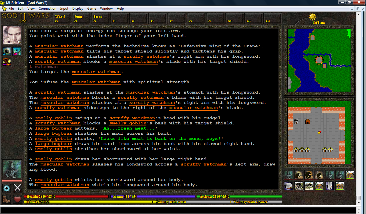
Okay, I've added a blur timer (an eye icon - I'm not happy with it but it'll serve until I can find something better). I've also tried moving the boot icon to the left, as this gives me more space under the map for drawing mini-avatars:
Hmm, I'm not sure I like it there either, especially considering that it'll be unnecessary to people that don't use invis. One thought I had would be to make the blur information display as an affect – again, I'm not at all sure how easy this would be, and given that blur is not an affect it might be impossible or unnecessary to have it display like that – but having something that only displays when it's pertinent could be a good thing. I like that the information is displayed but I could see where those who didn't want the information might get bored seeing it right there with other important displays, I'm not sure if it warrants that.
I definately like the move of the boot to the left side, definately seems to make things look cleaner.
KaVir said:
I'm wondering about putting the large enemy avatar on the right, beside the mini-avatars (so that targeting someone would effectively just increase the size of their avatar). I think I'd find it harder to monitor their health that way though.
Yeah, I definitely like the bigger avatar on the left side, for that very reason.
19 Oct, 2010, Tavish wrote in the 143rd comment:
I finally got everything in order for displaying the character panel. It is 4 tabs with each tab displaying different information. I hate the font and the colors but what the heck. I need to move on to other things and stop obsessing over details right now.

20 Oct, 2010, Rudha wrote in the 144th comment:
David: what he described is writing blob fields in a database, not writing image files to the filesystem
Maya/Rudha
Maya/Rudha
01 Nov, 2010, KaVir wrote in the 145th comment:
30-Oct-2010: Finally got the hotkeys working. There's a 'hotkey' command in the mud that allows you to specify a label and action for each hotkey, and you can either press the buttons or use the function keys on your keyboard. Because they're configured within the mud, you can specify different actions for each character - so your mage can have spells, your wolf can have pounce and claw attacks, etc.
I also reduced the size of the energy bars on the mini-avatars, allowing up to 3 rows of avatars to be displayed. They don't quite align up (they're off by a couple of pixels) but you don't really notice unless you zoom in. One thing I really need to add is a way to recognise your own pets, particularly for the up-coming Lich class, which will depend heavily on undead servants.
Finally, the maps now refresh properly for all locations. Previously they didn't show anything when inside the dojo, practice grounds, or various other buildings.
02 Nov, 2010, StdErr wrote in the 146th comment:
Woah, what's this, exactly? I use MUSHclient pretty much exclusively. Would this be compatible with the multiple small window setup I use? How would I set it up?
02 Nov, 2010, KaVir wrote in the 147th comment:
It's a plugin that I'm writing for MUSHclient, but it's specific to my mud - it's mainly intended as a journal of my experiences, as an example or reference for others who are interested in creating custom GUIs for their own muds. I think it'd be nice to see more muds offering their players custom interfaces, and MUSHclient makes it pretty easy to do so.
The current version doesn't work very well with a reduced window size, because many of the images rely on the extra screen space. So if you reduce the height you won't be able to fit in the mini-avatars, reduce the width more than a little and you won't see the maps on the right, etc.
However if you're thinking of creating your own custom GUI, you could of course cater for your preferred setup.
04 Nov, 2010, KaVir wrote in the 148th comment:
03-Nov-2010: After chatting with Splork, I decided to have a go at creating a SlothMUD-themed GUI, to see how easily the plugin could be adapted. It took around 2-3 hours in total (although I was watching TV and chatting online at the same time) - most of it was done in about half an hour, with the rest of the time spent tweaking the layout, troubleshooting a couple of problems carried over from my plugin, playing around with colours, and removing a load of unused code.
The graphics are from the SlothMUD website, giving the GUI a similar theme, with the layout designed to be similar to their flash client. For comparison purposes, the SlothMUD website is available here: http://www.slothmud.org/
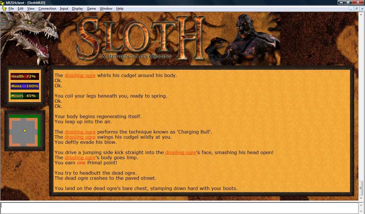
In practice I think a smaller title would work better, but this was just a quick experiment, and I didn't want to spend too much time on it. Many muds already have a graphical title, a background texture and borders on their website, and my intent was just to see how easily such images could be used to create a themed GUI.
The map would need to be done differently (because of the room-based thing), but I have some ideas for that, which I may implement if there's interest (it'd be great for a generic plugin, as most muds are room-based).
The graphics are from the SlothMUD website, giving the GUI a similar theme, with the layout designed to be similar to their flash client. For comparison purposes, the SlothMUD website is available here: http://www.slothmud.org/
In practice I think a smaller title would work better, but this was just a quick experiment, and I didn't want to spend too much time on it. Many muds already have a graphical title, a background texture and borders on their website, and my intent was just to see how easily such images could be used to create a themed GUI.
The map would need to be done differently (because of the room-based thing), but I have some ideas for that, which I may implement if there's interest (it'd be great for a generic plugin, as most muds are room-based).
11 Nov, 2010, KaVir wrote in the 149th comment:
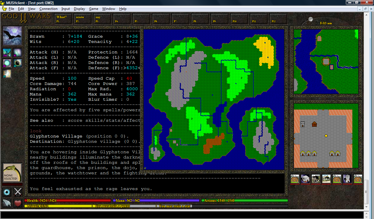
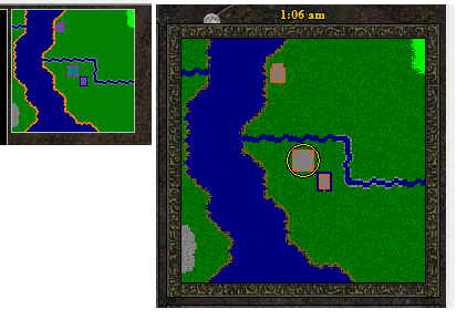
10-Nov-2010: I decided to have a go at creating a full map of the current world, which for now can be opened and closed by clicking on your avatar (just so that I could test it). It'll probably be opened by some sort of magnifying glass button on the border of the top minimap, but I've not yet decided how best to do it.
For the time being, the map only works for the Realm plane (the newbie world), and the index values are hardcoded into the plugin. For the Nexus (which is 9 times as large) I'm going to need much smaller tiles, and I'd rather not reveal it all up front - so I may have it reveal the map as you move around, and save the data between sessions.
For the time being, the map only works for the Realm plane (the newbie world), and the index values are hardcoded into the plugin. For the Nexus (which is 9 times as large) I'm going to need much smaller tiles, and I'd rather not reveal it all up front - so I may have it reveal the map as you move around, and save the data between sessions.
12 Nov, 2010, KaVir wrote in the 150th comment:
11-Nov-2010: I've been aware for a while that the maps can look a bit tile-ish, because of the simple fact that they repeat the same tile over and over - but it looks particularly bad on the full map (as you can see on the previous screenshot). Part of that was because I'd just halved the height and width of the normal tiles using Paint, so I got the mud to properly generate smaller tiles - however it still didn't look that great.
So I tried creating two of each tile set and alternating between them - it was better, but still not that good. Randomising them was a bit better still, but looked wierd when you moved around, as the whole landscape seemed to shake.
In the end I settled on five of each tile set, with the plugin selecting one psuedo-randomly each time it draws a tile, and I think the maps look quite a lot better.
22 Nov, 2010, learycm wrote in the 151st comment:
Everything here looks great KaVir, good work!
I was curious if anyone had put any info on how to get started doing this kind of thing all in one place anywhere before I go reading through this entire thread.
I was curious if anyone had put any info on how to get started doing this kind of thing all in one place anywhere before I go reading through this entire thread.
22 Nov, 2010, plamzi wrote in the 152nd comment:
This project is definitely taking shape. Keep it up - we need more and friendlier user interfaces that can get new players into MUDs.
Some feedback from a purely cosmetic/visual perspective:
One thing I'd recommend is choosing less grainy/contrasty textures for the hub frame and the map. The textures are a bit too busy right now, which takes focus away from what's really important – the text window and the mob icons. Busy textures tend to give an app a dated look, especially if they're also tiled.
For the minimap, i think you can't go wrong with solid colors - just tone down the vibrancy and make them more pastel, earthen, or just generally more muted. A nice touch would be if you can include multiple shades of the same basic color. In general, it's worth it to define a color scheme which includes multiple shades of only 2-3 primary colors and make sure your entire hub design adheres to the scheme. That way, the elements in the UI that are changing will naturally attract the eye because they won't follow the UI color scheme.
One thing that will really make a big difference is if the whole frame background is cut out from one large texture image: I found this link, which has some great examples.
Good luck with your project.
22 Nov, 2010, KaVir wrote in the 153rd comment:
The background texture and borders are designed to match the website, although if anyone wanted to replace them it would be as simple as saving over the old images. As I've said before, this is really more of a demo/journal than anything - other muds will want to use their own themes.
The minimap did originally use solid colours, and it was one of the earliest things I changed - if you compare the two it should be easy to see why:
Regarding the use of colours, if you go back to post #98 and its replies, you'll see there was already a lengthy discussion on the topic - although once again this is something that people could easily change if they wished.
23 Nov, 2010, plamzi wrote in the 154th comment:
Well, for what it's worth, I like the original minimap better. The bright orange, pink, and green are the real issues with it for me, not the lack of texture. I'd also thin out the frame – it's disproportionately wide for the content it's framing.
That said, advice is cheap and plentiful. Coming from someone who's muddled in web and book design, mine is only a tad less cheap.
That said, advice is cheap and plentiful. Coming from someone who's muddled in web and book design, mine is only a tad less cheap.
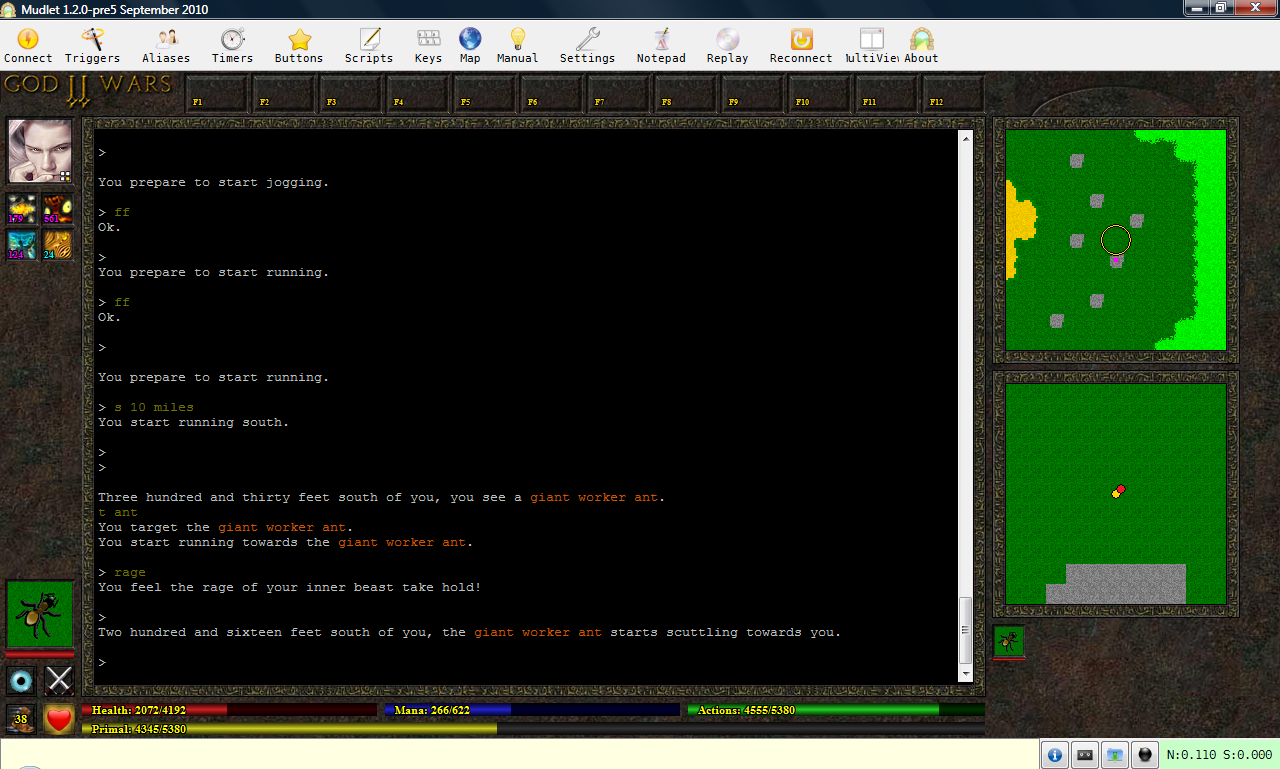
08 Feb, 2011, KaVir wrote in the 155th comment:
I recently decided to find out if I could create a similar GUI for Mudlet, and the answer is "pretty much". It's still not entirely finished - I need to tweak the bar colours, add the multiple tile sets, the sun/moon icon and time, the hotkeys and mouseover/mouseclick stuff. And it looks like I'll have to leave out the pie-shaped icon timers. But as you can see, the results are fairly similar:
Here are my thoughts on creating GUIs for the two clients, based on my scripting experiences with each:
Development: In MUSHclient you create the initial plugin, then you can edit it with whatever text editor you prefer. Mudlet requires you to use its own built-in custom editor, which can be considered either a pro or a con depending on the preferences of the individual developer. I didn't like the Mudlet editor at first, but it's grown on me somewhat - although I do still like using my "usual" programming editor for MUSHclient as well.
Portability: Although MUSHclient can run under WINE, it's not perfect - I know a few people have tried to get my plugin working that way, but none have succeeded. Mudlet appears to be much more portable, although I admit my knowledge in this regard is only second-hand. I plan to investigate this further in the future.
Graphics: Mudlet allows images to be loaded and displayed, but not much else. MUSHclient also allows the images to be manipulated (rotation, masking, resizing, clipping, etc), and offers drawing functions as well, giving the scriptor considerably more power and flexibility.
Protocols: Both clients support MCCP, but only MUSHclient supports MXP. MUSHclient also allows you to add your own out-of-band protocols, while Mudlet only supports 102, ATCP and GMCP. As a server developer you can work around this to some degree - for example I send MSDP and MSP data to Mudlet using a custom ATCP package - but it's not ideal.
Interface: Mudlet provides a simpler interface than MUSHclient, the latter of which can sometimes prove overwhelming for newbies. On the other hand, MUSHclient also has its own established fanbase.
Documentation: Both clients offer manuals/documentation, but MUSHclient's is considerably more thorough, while Mudlet's is rather patchy and incomplete.
Activity: Both clients are actively developed and their staff are responsive to feedback. Both clients are also free to use and open source, meaning that should the developers one day lose interest, someone else could pick up where they left off.
To summarise my opinion:
Mudlet is more portable, and offers a simpler interface for first-timer mudders.
MUSHclient provides stronger graphic and protocol support, and offers better documentation.
Both clients can be scripted in Lua, and a lot of your code can be copied from one client to the other, so this certainly isn't a case of double the effort. The screenshot I posted earlier was the result of 7 evenings work, spread out over around 2.5 weeks, and that includes the time spent getting to grips with the Mudlet scripting system.
However I would recommend finalising the GUI for one client before starting work on the other. I found it saved a lot of time knowing exactly what I wanted to draw, while in MUSHclient I spent a lot of time experimenting with different layouts.
08 Feb, 2011, sankoachaea wrote in the 156th comment:
Mudlet runs under Mac, Windows (tested both) and Linux (personally tested on most recent versions of Arch, Debian, and Ubuntu)
I believe Mudlet offers more in regards to graphics and out-of-band protocols then you credited it in this post, however, its documentation -is- lacking a bit. The project is more actively developed then MUSHclient (at this particular point in time) and most of the effort seems to be focused on implementing and testing changes rather than documenting them.
I'm sure if you posted on the Mudlet forums (forums.mudlet.org) you could get more information on those specific features.
09 Feb, 2011, KaVir wrote in the 157th comment:
sankoachaea said:
I believe Mudlet offers more in regards to graphics and out-of-band protocols then you credited it in this post
I'm just sharing my opinions, based on what I've found so far - I like both clients, and would consider either a good choice for designing a custom GUI, but each has its pros and cons. To give some examples about the graphics:
1) I use large avatars for the player's character and their current target, but mini-avatars below the maps for other people nearby. In MUSHclient I simply specify the size of the avatars when I draw them, but in Mudlet I had to literally provide two sets of avatars, one of each size.
2) In MUSHclient I can define images as being transparent by setting a flag in the script. In Mudlet I have to manually create png files with transparent backgrounds (I do this via a third party tool).
3) In MUSHclient I draw a circle in the upper map to indicate your position, and dots in the lower map to indicate your character as well as other creatures and objects. In Mudlet you can't draw shapes, so I had to create png files with transparent backgrounds and draw them on top of the map.
4) In MUSHclient I draw a pie-shaped image and blend it over the icon to create a timer effect (originally demonstrated here by Nick Gammon). As Mudlet can't draw shapes, the only way to do this would be by creating a pie icon for every possible position.
5) In MUSHclient I have "strips" of tiles - for example the top map uses a single bmp 20 pixels high and 20480 pixels wide, representing 1024 tiles side-by-side. The plugin loads the image into memory and chops out pieces of it as needed to quickly assemble the map. In Mudlet I have to store each tile in a separate file, and load them individually.
At the end of the day I can achieve much the same result in either client, but MUSHclient makes it easier.
In regard to out-of-band protocols, as I stated earlier, Mudlet supports 102, ATCP and GMCP, and it doesn't allow you to add your own. This put me off the first time I tried creating a Mudlet script, as my mud only supported MSDP and ZMP. In the end I implemented ATCP specifically for Mudlet users (and I also extended it to handling sound triggers, as Mudlet doesn't support MSP either).
As far as development activity is concerned, MUSHclient released 26 different versions last year, so I consider that fairly active. Of course Mudlet is also pretty active, which is why I didn't list activity as a "pro" for either.
It'd be interesting to see if the same GUI could be adapted to CMUD as well, and how easily it can be done compared with MUSHclient and Mudlet, but I'm not going to buy a copy just to find out.
09 Feb, 2011, sankoachaea wrote in the 158th comment:
I'm very familiar with MUSHclient's release cycle. When I said 'active' I meant new features go into code on the daily (Mudlet being younger naturally has more ground to cover than a client that has been in development for over a decade.) It wasn't at all suggesting that MUSHclient is not being actively developed.
As far as the graphics go, what I meant is that I'm fairly certain – (I will check with Heiko about this) – that there are specific functions similar to what you are using in MUSHclient but they may not be in the manual yet.
Also, forgot to comment on the project in general: Looks great! :]
As far as the graphics go, what I meant is that I'm fairly certain – (I will check with Heiko about this) – that there are specific functions similar to what you are using in MUSHclient but they may not be in the manual yet.
Also, forgot to comment on the project in general: Looks great! :]
09 Feb, 2011, KaVir wrote in the 159th comment:
sankoachaea said:
As far as the graphics go, what I meant is that I'm fairly certain – (I will check with Heiko about this) – that there are specific functions similar to what you are using in MUSHclient but they may not be in the manual yet.
I already asked on the Mudlet forums, and was told that Mudlet doesn't currently support image resizing or drawing shapes. The issue with the map tiles came up in June last year, when Vadi was helping me test ATCP.
Either way, none of this was intended as criticism of Mudlet. It's a superb client, as is MUSHclient, and I'd like to offer GUIs for them both.
09 Feb, 2011, sankoachaea wrote in the 160th comment:
KaVir said:
Either way, none of this was intended as criticism of Mudlet. It's a superb client, as is MUSHclient, and I'd like to offer GUIs for them both.
:] Conversely, I didn't intend to criticize MUSHclient. I use both clients for different things and have been working on a fork of MUSHclient for a solid two years now.
As it happens, the graphics functions I was thinking of aren't implemented -yet-. Vadi had asked me a while back to start working on QML integration and that would allow for the things you're talking about, but is not yet in the code. This might have just bumped that task up on my priority list. :D
Random Picks
That's what the 12 buttons across the top will be for - you can click them with your mouse or hit the function key on your keyboard.
Okay, I've added a blur timer (an eye icon - I'm not happy with it but it'll serve until I can find something better). I've also tried moving the boot icon to the left, as this gives me more space under the map for drawing mini-avatars:
I'm wondering about putting the large enemy avatar on the right, beside the mini-avatars (so that targeting someone would effectively just increase the size of their avatar). I think I'd find it harder to monitor their health that way though.
Hmm nice idea. I did have my plugin do nothing until MSDP had been successfully negotiated, as I was worried about conflicts with plugins for other muds, but that's not necessary - your screenshot reminded me to remove it. So the next version will display the pretty interface the moment you open the connection.
I've also wondered about having an alternative display for character creation, and perhaps for in-game building as well.